Showing posts with label House Design. Show all posts

Thursday, July 14, 2011

Comma Workshop Quilts

So this is going to be my first post using Windows Live as my new blog post editor.  I got so unbelievably tired of the format of blogging directly in Blogger (Y’all are part of Google, damn it.  If anyone should have the resources to make a good user interface, you should be all over that.)
So don’t be alarmed if things are a bit wonky whilst I work out the kinks.
Speaking of other things that are firsts, my friend Kerry wrote me for the first time in a long time.  She was in Architecture school with me and has an excellent eye for modern design, interwoven with a passion for vernacular and craft and time-honored traditions of yore.  I really respect so much how she’s been able to coalesce these ideas, especially in a way that is innovative when it is somewhat of a trend right now.
Her newest venture is a design studio that she runs out of Colorado called comma workshop.Comma Workship Quilt Courtesy Comma Workshop
Comma Workshop Qulit Courtesy Comma WorkshopThey handcraft really beautiful quilt designs that feature cursive text in modern graphic ways all over the field of quilting.  Now, my mom always loved quilts, especially of the Amish variety, but these definitely aren’t your mother’s quilt.
Personally I always thought quilts were weird and tacky unless they had some sentimental connection.  (You know, like they’re made entirely from your Great Grandfather’s used and discarded underwear… Wait, that’s still weird.  Really weird.  Just threw up a little in my mouth.)  But these are pieces of art and distinctly modern ones that marry a warmth of sentiment and words and history while making total sense in a downtown loft.
Comma Workshop Quilt Courtesy Comma WorkshopThis just makes me incredibly envious of Kerry’s talent.  In fact, I should probably end this post before I start swearing at her online.  I wonder if Windows Live has a “search for regrettable comments” feature near the spell check.  I should look into that.

Wednesday, July 13, 2011

Refinishing- How to strip off old paint

Continuing in the current trend on this blog of pushing everybody’s race buttons as a means to celebrate the 4th of July, the Mrs and I started a project on the 3rd and continued on the 4th that set out to obliterate the self image of a young African American girl in our neighborhood.

No, not really.  Well, kinda, but we didn’t do anything wrong.

We did, several months ago, find a dresser piece abandoned on the side of the road in our neighborhood.  We took a quick look, and discovering it to be mostly solid wood, decided to take it home for refinishing.

What made it unique is that a woman we can only assume is named Deidre Hicks, based on the label inside, had decoupaged the entire surface of the thing with cutouts of African-American women from fashion magazines.  But Miss Deidre obviously no longer wanted to hold on to it, so we don’t feel particularly bad about scraping it all off.  Not that it wasn’t beautiful in its own personally significant way, but I’m not sure how we’d design a room around it.

Anyways, the biggest hurdle in the refinishing process is getting the old stuff off.

First, remove all the hardware.  There’s no reason to make the job harder for yourself by having to work around tiny pieces. 

Second, remove all the doors and drawers.  Again, the more you can eliminate the joints and crevasses where paint is inclined to be un-removable, the better.  Its easier to put it back together than to dig out all those tiny bits.

Third, apply a coat of chemical stripper with a paintbrush.  In our experience, the best practice here is to only tackle two 2’x2’ areas at a time.  Apply stripper to the first area and then let it sit while applying it to the second.  Go back to the first and it should be ready for the first scraping. It'll get all bubbly like a toxic apple pie when it's ready.

Sidenote:  I’m not a fan of safety but I can agree that rubber gloves are helpful here for the average user.  There’s a slight burn if you get it on your skin.  I would recommend the thin medical rubber gloves though.  You are going to be applying in small doses and doing a lot of scraping, so cumbersome dishwashing type rubber gloves get in the way.  None of the pictures shown illustrate the usage of rubber gloves because I'm really macho... when I'm doing a refinishing/decorating project.

Fourth, using a plastic or metal scraper, apply pressure to the bubbly mass of paint.  One long continuous motion is usually the best to get the whole way down to the wood, or as far as you can get in one stripping.  If the paint on the piece is especially soft, you may find that you can simply wipe it off with a rag.  Good on you.  It definitely keeps you from gouging the wood with a scraper, which you otherwise should wield with caution.

Fifth, repeat as necessary.  Then repeat again.  And again.  And again.  Until you get to this:
 
LOOK! Pretty solid oak.  Well, mostly solid.

In our case, we’re still debating what kind of finish we’d like this to have.  The more transparent finish you desire, the more paint you’ll need to get off of the bare wood.  Clear coats and transparent stains really require you to have every last speck of paint off, while fully opaque latex really only require that you create a smooth substrate for the new coat.

We’re leaning toward a semi-transparent stain, possibly in white or a colorful hue, which will still allow the wood grain to show through.  Although as I do the research, I might be interested in trying out some combination of  milk paint and chalkboard paint. Check out these shots:

Photo via Design Sponge
Photo via Casasugar

Tuesday, July 5, 2011

Porch Design Tips

It’s been about a month since I posted last.  In my defense, I was struggling with how to write the promised post that focused scathing reviews of the horrible things people do when putting a front porch** on their house. 

Wait, that’s a lie.  Okay, honesty time… I’ve been drafted into a secretive government group that monitors cultural trends and reports back to our superiors so they can enact more legislation that takes the fun out of life. 

Wait, still a lie… I was far too busy at my boring Architecture job. 

Nope, not quite there yet… it was hot out and that makes me lazy and cranky.

There we go.  And it really makes me wonder how we’d ever move to the beautiful south where the front porch is a staple of humid weather living.  I mean, I’d never use mine because I’d be sequestered and naked in an ice filled bathtub in a womb-like air conditioned environment.  Just to protect the world from my crankiness induced fury.

But for most people, the porch is a necessity in the hot summer.  But friends, necessity should never trump taste.  If you can’t figure out how to make a porch on your house which is architecturally pleasing, you shouldn’t be allowed to have one.

That’s where I come in.  As a self declared arbiter of taste and style, I would be happy to give a no holds barred, crotchety review of your existing porch or porch plans.  Just upload a pic in the comments or send me a link and I’ll rip you a new one.

Doesn’t sound appealing?  Okay, here’s a review of some horrible things you should NOT do, courtesy of the nameless residents of Beaufort, SC and a few others.  To be fair, there were far more beautiful examples of what you should do, and we’ll touch on those at the bottom.
Not Proportional to the House
Your porch should be proportional to the house, not the front door.  If its only serving the purpose of keeping people dry whilst they ring the bell, you’ve wasted an opportunity.  Especially if your house is as ugly as this one in which we stayed.

Not Structurally Proportional
Your porch should LOOK structurally proportional.  This pink monstrosity appears to be supported by toothpick posts which I almost sawed off in the middle of the night just to teach them a lesson.  Additionally, there’s no sense of hierarchy.  Either the two outermost posts or the two posts that frame the entry should have been larger.  Of course, that would have led to some weird balance and symmetry issues on this famous inn, but I can’t comment on all the things wrong here.  This deserves a full razing of the building anyways.


Column Style not conducive to residential Style
The scale and proportion and order of your columns especially speak to the importance of your building.  This is the JohnMark Verdier house and museum.  And it seems to imply that Jesus lives here.  I can accept that Verdier was some kind of local historic figure, so I’ll give him a pass.

On a related note, unless you're the President of the United States, you never have the right to have double height columns on your ordinary abode.  (Double height columns being the ones that support a two story porch with no intermediate balcony.

NEVER.

Never Double Height Columns
There's no compromising on this one folks.  If your house has double height columns like the one above  in our neighborhood in Philadelphia, stop reading.  Go outside.  Saw, chew, or burn them off now.  This is a massive monstrous FAIL.

Unnecessary Columns

Admittedly, sometimes people are poor.  We feel bad for them and but for the grace of God would be in the same boat.  But while I can support many social reform initiatives and even some softening of judgmentalism based on cultural factors, it doesn’t take more money to have good taste.  In this case, less would have been more.  Take out those center two most columns, moron.  They don’t match, they serve no structural purpose, and they’re proportionally stupid in their placement.
Unnecessary Everything...

But more commonly, it’s too much money that goes with bad taste.  A porch is still a porch and if you dump so much detailing into the front of your house as to be ostentatious or gaudy, you deserve to be taxed incessantly to teach you a lesson about not being a moron.  This example from Savannah, is just fugly .  And oddly enough, it is  sexy, but in a hooker-y kind of way.


But lest you think I’m all diatribe and no love, here’s a few examples of some graceful, practical, and understated porches to which you can aspire when planning your next project.

**Lastly, it should be noted to the extremely sensitive, that yes, I am a white man.  But once again, I have discovered by going to urban dictionary that I was more ignorant of the extent of racism/classism attached to the idea of a porch than one might expect.  I grew up in a surprisingly diverse farm town and I guess no one ever sat me down and taught me all the racist jokes or ways to identify people I’m supposed to hate.  So, if you’re about to spout off in the comments, do yourself a favor, and consider whether being someone who bitches about people’s dumb choices regardless of their race or economic status isn’t the goal we should all aspire to anyways.

Friday, June 10, 2011

Considering Fences

The fence could be the perfect emblem of American ideas about property.  Theoretically, one can tell so much about a property owner and their view of the world with this one little architectural statement.  Do they believe they "own" the land?  How do they feel about outsiders?  Do they believe they have a responsibility to the public?  How do they feel about beauty? 

At a fundamental level, a fence is a wall.  A wall can keep things out, a wall can keep things in.  A wall can define space.  A wall can create privacy.  A wall can protect you against the elements.  A wall can just be a piece of art, a beautiful thing to look at. 

A wall can be all of those things in varying degrees.

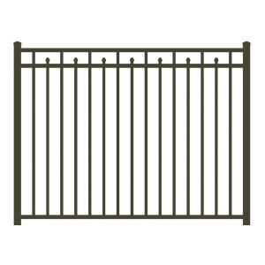
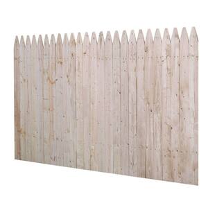
Thinking about fences the same way, every fence we see should theoretically be different.  But more often than not, the fence is just something you pick up at the Home Despot, for the bottom dollar price.  Everyone has the same five designs all over the country.  There are minor variations, sure, but witness:

The Split Rail:
The Wrought Iron 
(or makeshift aluminum version thereof):

 
The Picket:

 The Stockade:
The Chain Link:

I really like to judge people by the fence they put up.  And most people FAIL.

Because there are such beautiful, distinctive opportunities out there...  We could do so much more with this little piece of wall that is the first thing you see when you approach the home.  Why do we rely on the cheap crap that the marketing department at the big box stores decide is the least common denominator... most likely to sell the highest number of consumers?  As price tags go, upping your fence from the mundane above to the unique elements below isn't that costly.  It's just a matter of design.


Image Courtesy  Production Fenceworks
 But this whole post was really inspired by an email I received from Cape Cod Fabrications, a metal shop in, you guessed it, Massachusetts.  These are a couple of the images from their site that inspired my rage, because this is what the American home should look like:

Image Courtesy:  Cape Cod Fabrications

That last one is my favorite.  The tube steel members are each separately embedded in the ground (I assume).  But look at how something can be so "strong" and so transparent at the same time.  Ok, admittedly, that's going to be a pricey one.  But ultimately, shouldn't this be more important than the ginormous master bathroom that you spent $75,000 on? 

Its a place where you take a dump for goodness' sake! 

Priorities, man.

Thursday, April 28, 2011

ADAPT Modular Shelving

Why place your furniture based on the irregular shape of your room?

When instead, you could alter your furniture to fit the irregular shape of your room?

 Check out ADAPT Modular Shelving


Again, I cite this as the reason that we accept designers being douchey. (Not necessarily this guy, but just the general population including me, as a rule.)  Douchey people that bring us cool stuff like this are allowed to continue in their douchitude.

I mean, you could accomplish this with a jigsaw and some 2x4's and some 3/4" shelving.  But that assumes that you're handy, then you couldn't take it with you to the next apartment.

Wednesday, April 27, 2011

Dreaming of a Renovation?

As an architect, the sad news I often have to give to clients involves money.  No one likes to think about how much things will cost when they're dreaming of new renovation to their home, but its an unfortunate reality. 

But most homeowner's don't have a realistic measure of what things will cost when they are dreaming away, and that makes the sticker shock of contractor's price all the more painful.  Especially when it comes to what Architects call "MEP" work.  Mechanical, Electrical, and Plumbing... it's the stuff that makes your house WORK, but its behind the walls or cabinets or in the basement so it doesn't get much attention in the dreaming phase.

To that end, here's a brief synopsis of where your dollars will go when it comes to the real MEP nuts and bolts of a renovation. 

In order of costs, high to low...

P is for Plumbing- 

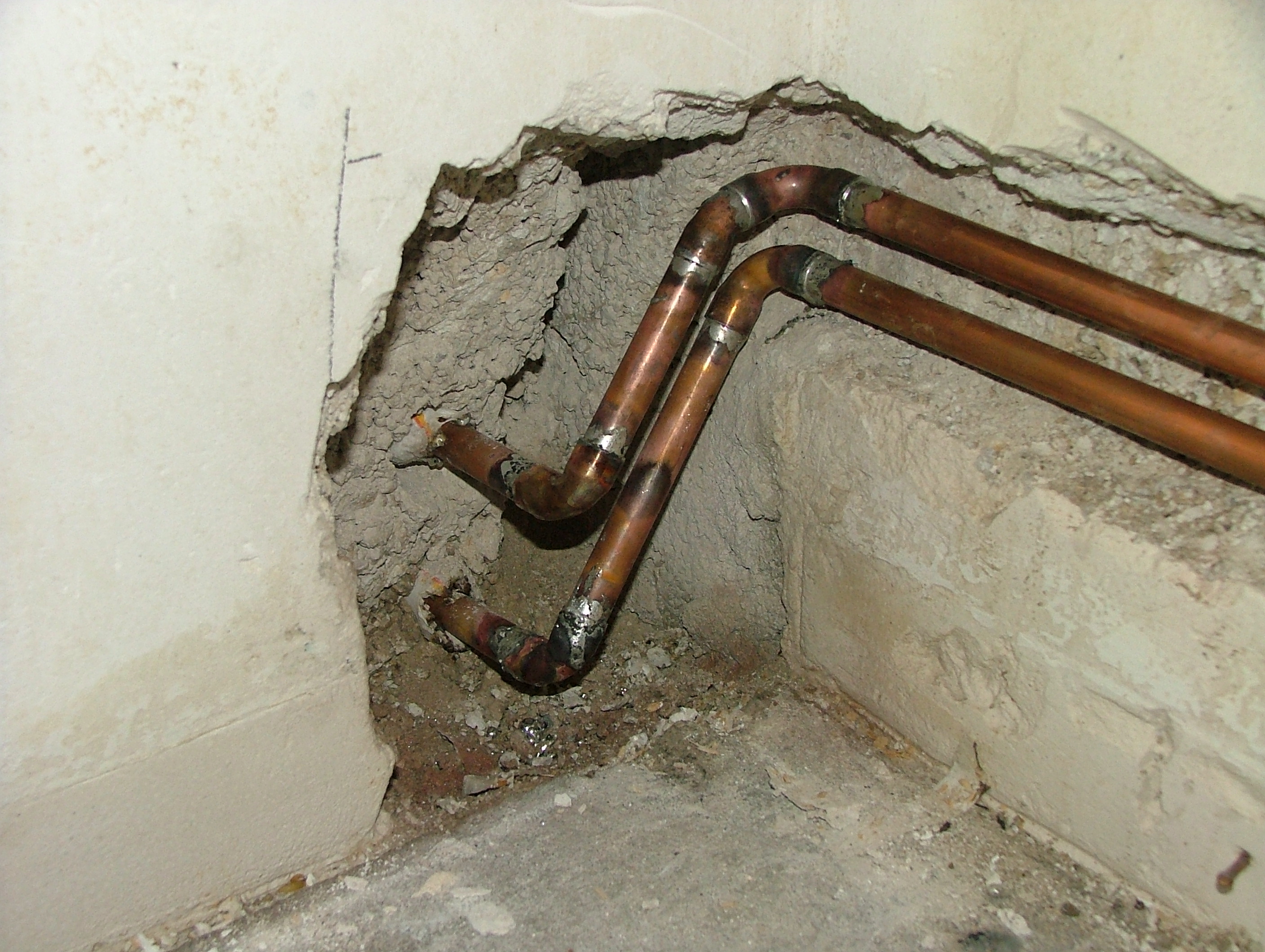
Moving plumbing fixtures, anything that requires water, hot and/or cold, and waste lines (where the water goes once you've mixed it with the dirty stuff) is probably the most expensive.  This is for several reasons:  Pipes are rigid and have to be connected at specific angles and pitches, so the work of getting them through a wall, floor, or tight space is tricky.  Plumbers are one of the highest per hour laborers, and justifiably so, because even the most experienced has to deal with a good bit of trial and error on connections. 

Plumbing fixtures themselves are expensive, and copper and cast iron aren't exactly cheap metals for pipe.  More and more municipalities are allowing PVC piping for various purposes, and some are even allowing flexible piping such as PEX. 

Another thing to consider here is that waste lines are significantly bigger, harder to move, and more prone to problems with age.  And of the big wet plumbing fixtures, your toilet and your shower or tub are going to be the most costly to move because the wasteline has to go straight through the floor, so you're often having to rip out flooring or the ceiling below.

M is for Mechanical-

 Mechanical, which pretty much covers everything that delivers heat and cooling to your home can vary widely based on the system you're working with and the space that you've got to work with.  If your heating system is supplied with hot water or steam, such as to radiators or radiant flooring, you're veering more toward the plumbing end of things and running into the same issues as above.  If your heating system is with electricity such as electric baseboard heating or electric radiant flooring systems, you veer towards the Electric costs below. 

But a lot of people have forced air systems, which can supply both heating and cooling in one package, delivered through ductwork.  Ducts are BIG honkin things, and getting them through all the cavities and walls to the location you need presents many of the same challenges as plumbing.  However, ductwork is easier to work with and you can often use flexible ductwork when you get near the end of a "run". (A "run" is the path from the heating/cooling unit, most likely in your basement, to the actual diffuser or grill that pushes the air into the room).

E is for Electric- 

Wires are tiny.  And they're easily cut and spliced together.  With the exception of some appliances that need a lot of electricity, such as a refrigerator, or a microwave, (anything that makes things hot or cold, generally) a new supply outlet can often just be connected to an existing without going the whole way to your panel in the basement.  Electricity is pretty easy to work with, even for the DIY home renovator, with some precautions. 

We would caution though that the costs skyrocket when you get to moving the panels or breakers that are the first electrical items that distribute power from the municipality power lines coming into your home.  Don't move them if you don't have to.  (And don't do it yourself, most likely.)